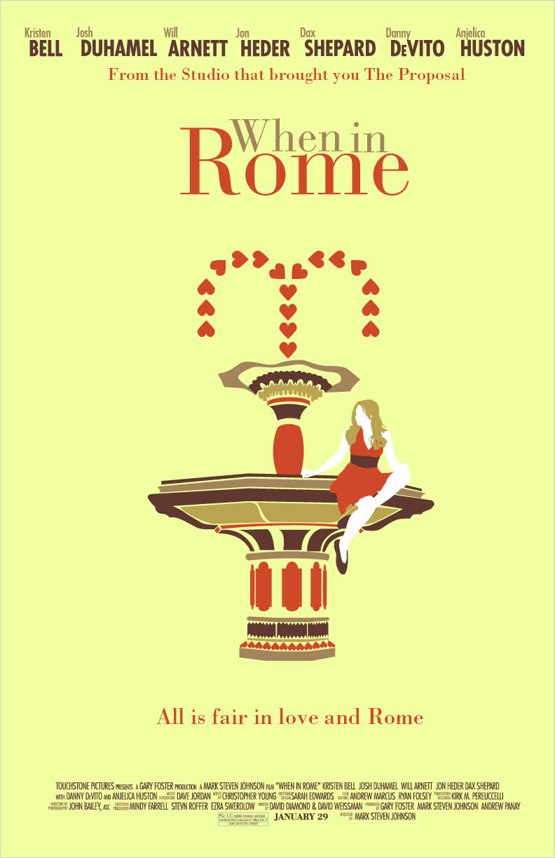
So I had to do a couple different variations of a movie poster of our choosing for my Typography I class and I decided to pick "When in Rome." The movie was so-so, but it was really awesome how they switched back and forth from Rome and the Guggenheim museum in NYC. Their lack luster movie poster is inexcusable for a movie that was filmed in two of the most beautiful places in the world, so I had to remedy this. I wanted to introduce Italian architecture into my piece, so I did a little research and created the graphic fountain based on some of my findings. The fountain is really important to the story, so it's a good fit. I played around with some color schemes, but I think I really like my first piece (the asymmetrical one) best.
Also, props to my friend Sophia for modeling for me and letting me take a zillion pictures of you!
"When in Rome" movie posters
11"x17"
Illustrator, InDesign, photography


No comments:
Post a Comment