Wednesday, March 30, 2011

Book Covers

So for Typography, we have to do a series of three book covers and, of course, I had to pick my favorite book series, The Spenser series, by Robert B. Parker.  In my opinion, his books are amazing and quite intelligent mystery novels, but 95% of his covers are horribly ugly.  (Seriously, look up the cover for Stardust, it's disgusting).

I have the same assignment for my Illustration Concepts II class, so I'll be doing six different covers.  Good thing I've been wanting to do this project for a while!

Here is the first completed book cover:
6.25" x 9.25"
Illustrator, InDesign

 
The cover probably needs a little explanation.  The book is about this actress named Jill Joyce who hires Spenser as a body guard and find out who is sending her threatening messages.  For the first third of the book, the threats are just word of mouth, until Jill goes to her dressing room to find a doll of her hung by the neck over the door frame, which is really important to the story.

Wednesday, March 23, 2011

Movie Posters

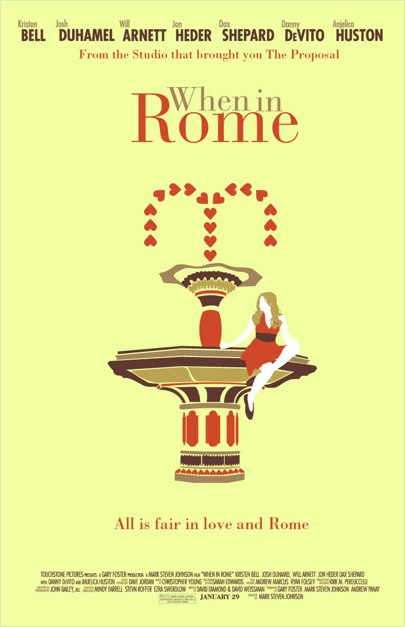
So I had to do a couple different variations of a movie poster of our choosing for my Typography I class and I decided to pick "When in Rome."  The movie was so-so, but it was really awesome how they switched back and forth from Rome and the Guggenheim museum in NYC.  Their lack luster movie poster is inexcusable for a movie that was filmed in two of the most beautiful places in the world, so I had to remedy this.  I wanted to introduce Italian architecture into my piece, so I did a little research and created the graphic fountain based on some of my findings.  The fountain is really important to the story, so it's a good fit.  I played around with some color schemes, but I think I really like my first piece (the asymmetrical one) best.

Also, props to my friend Sophia for modeling for me and letting me take a zillion pictures of you!

"When in Rome" movie posters
11"x17"
Illustrator, InDesign, photography


Monday, March 21, 2011

Frank Final

Anne Frank Book Cover
India Ink Brush Pens, Graphite, Photoshop

Banner

It was high time for me to finally put a banner up for this site.  I tweaked one of my pages from "Anti-Love Potion" and I think it looks pretty good.  And that's all for now!

Friday, March 11, 2011

WOW! for Words on Wheels

Keep your eyes out for shy looking ballerinas next time you ride the MTA!  The results are in and my color version of "The Performer!" won first place and will be used on Baltimore City buses and light rail cars.  "About Me" only came in third, which is a little disappointing, but I am more excited about the winning entry.


Tuesday, March 8, 2011

Moar Produce!

As you can tell, I am having a little too much fun with these produce alphabets.  I have another alphabet made out of asparagus that I will clean up in Photoshop and post over break.

Psychedelic bread

Having fun with color.  And bread.  I took pictures of an alphabet I made out of ripped bread, turned them into graphic shapes in Photoshop, and had fun moving them around.  It was a very fun project and a much more productive way to use up stale bread.

Type Compositions
Bread and Photoshop