Blogger really oversaturated the yellows in the full-size previews, but the colors are correct in the thumbnails you see below. No idea why that happen.
I decided to go with the color burn texture. The critique for the covers went really well and I think I am satisfied with the end result.
Illustrator, Indesign
9.25"x20.6"
Showing posts with label spring. Show all posts
Thursday, April 28, 2011
Monday, April 25, 2011
Potshot Book Covers
Still working on those Robert B. Parker book covers, but this and two other covers still under construction are for Illustration Concepts instead of Typography. I'm playing with texture and filters, and am a little torn which version of Potshot I should turn in. I could really use some opinions since this is due on Thursday.
Potshot no filter v.1
Potshot no filter v.2
Potshot hue
Potshot multiply
Potshot no filter v.1
Potshot no filter v.2
Potshot color burn
Potshot hue
Potshot multiply
Labels:
2011,
badge,
book,
book cover,
fangs,
filter,
filters,
final,
illustration concepts,
illustrator,
mystery,
Parker,
police badge,
Potshot,
rattlesnake,
Robert B. Parker,
sheriff,
snake,
spring
Tuesday, April 12, 2011
Flower Your Spoons
For this week's Hand Letter's assignment, we had to make an entry for Spoonflower's alphabet contest. The contest required us to create an alphabet and turn it into a pattern that can be printed on fabric. We could only submit one and I chose the red, orange, and pink version; but I thought to include the other versions in this post since it was a tough decision.
Photoshop and marker
18"x21"
Photoshop and marker
18"x21"
Labels:
2011,
alphabet,
contest,
fabric,
Hand Letters,
pattern,
photoshop,
spoonflower,
spoonflower.com,
spring
Friday, April 8, 2011
Got MILF?
I just can't let this one book cover go. Did some more tweaking and I've noticed the more I edit, the hotter the mom gets. BTW, I want that cocktail dress she's wearing really badly.
Labels:
2011,
book,
book cover,
milf,
murder,
mystery,
paper doll,
Robert B. Parker,
spring,
typography
Paper Doll Revamp
I wasn't totally satisfied with how the Paper Doll cover turned out, so I spent the day tweaking it and I think it looks a lot better.
Labels:
2011,
book,
book cover,
family portrait,
mystery,
paper doll,
picture frame,
revise,
Robert B. Parker,
Spenser,
Spenser series,
spring,
typography
Wednesday, April 6, 2011
Book Covers
Here are the finalized front covers of my Typography class's book cover assignment. I'll post pictures of them printed out and bounded onto the books by next week.
Illustrator and InDesign
6.25" x 9.25"
Illustrator and InDesign
6.25" x 9.25"
Labels:
2011,
bad business,
book,
chains,
cover,
doll,
illustrator,
indesign,
paper doll,
photograph,
rings,
Robert B. Parker,
Spenser,
Spenser series,
spring,
stardust,
typography,
wedding bands
Tuesday, April 5, 2011
Hand Letter Mural
This following are a few different colored versions of a hand lettered mural for a restaurant in Hampden called Alchemy. It was a three week assignment for Hand Letters, but I decided to scrap what I had and spent all day making this, which I'm glad I did. The restaurant is pretty classy and the owner already has a bunch of framed photos on the adjacent and parallel walls, so to avoid making the room too cluttered, I went with a simple, yet elegant mural.
Labels:
2011,
Alchemy,
food,
Hampden,
Hand Letters,
mural,
restaurant,
spring
Wednesday, March 30, 2011
Book Covers
So for Typography, we have to do a series of three book covers and, of course, I had to pick my favorite book series, The Spenser series, by Robert B. Parker. In my opinion, his books are amazing and quite intelligent mystery novels, but 95% of his covers are horribly ugly. (Seriously, look up the cover for Stardust, it's disgusting).
I have the same assignment for my Illustration Concepts II class, so I'll be doing six different covers. Good thing I've been wanting to do this project for a while!
Here is the first completed book cover:
6.25" x 9.25"
Illustrator, InDesign
I have the same assignment for my Illustration Concepts II class, so I'll be doing six different covers. Good thing I've been wanting to do this project for a while!
Here is the first completed book cover:
6.25" x 9.25"
Illustrator, InDesign
The cover probably needs a little explanation. The book is about this actress named Jill Joyce who hires Spenser as a body guard and find out who is sending her threatening messages. For the first third of the book, the threats are just word of mouth, until Jill goes to her dressing room to find a doll of her hung by the neck over the door frame, which is really important to the story.
Labels:
2011,
book cover,
illustrator,
indesign,
Parker,
Robert B. Parker,
Spenser,
Spenser series,
spring,
stardust,
typography
Wednesday, March 23, 2011
Movie Posters
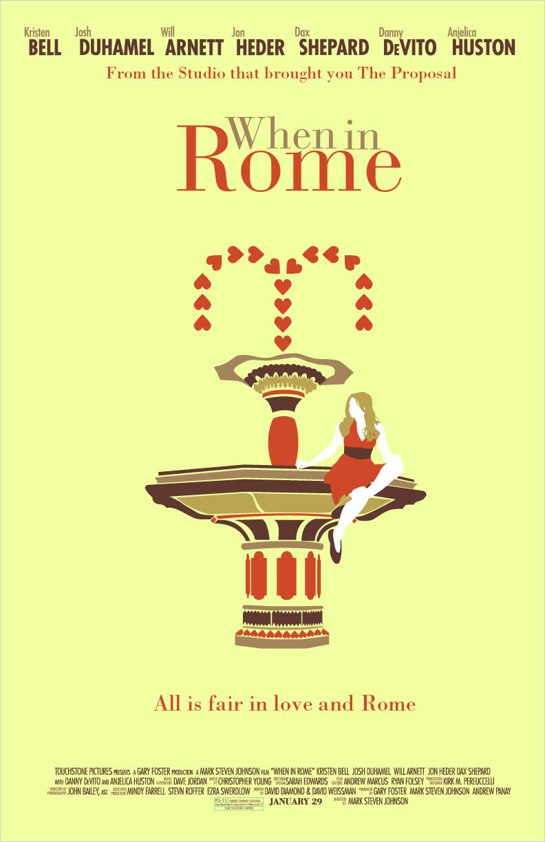
So I had to do a couple different variations of a movie poster of our choosing for my Typography I class and I decided to pick "When in Rome." The movie was so-so, but it was really awesome how they switched back and forth from Rome and the Guggenheim museum in NYC. Their lack luster movie poster is inexcusable for a movie that was filmed in two of the most beautiful places in the world, so I had to remedy this. I wanted to introduce Italian architecture into my piece, so I did a little research and created the graphic fountain based on some of my findings. The fountain is really important to the story, so it's a good fit. I played around with some color schemes, but I think I really like my first piece (the asymmetrical one) best.
Also, props to my friend Sophia for modeling for me and letting me take a zillion pictures of you!
"When in Rome" movie posters
11"x17"
Illustrator, InDesign, photography
Also, props to my friend Sophia for modeling for me and letting me take a zillion pictures of you!
"When in Rome" movie posters
11"x17"
Illustrator, InDesign, photography
Labels:
2011,
architecture,
fountain,
guggenheim,
illustrator,
indesign,
italy,
love,
photography,
rome,
spring,
typography,
when in rome
Monday, March 21, 2011
Friday, March 11, 2011
WOW! for Words on Wheels
Keep your eyes out for shy looking ballerinas next time you ride the MTA! The results are in and my color version of "The Performer!" won first place and will be used on Baltimore City buses and light rail cars. "About Me" only came in third, which is a little disappointing, but I am more excited about the winning entry.
Tuesday, March 8, 2011
Moar Produce!
As you can tell, I am having a little too much fun with these produce alphabets. I have another alphabet made out of asparagus that I will clean up in Photoshop and post over break.
Labels:
2011,
alphabet,
Hand Letters,
peppers,
photography,
produce,
spring,
string beans
Friday, March 4, 2011
Works in Progress
Few more things I'm working on. The first is an entry for the Type Designers Club's 58th Anniversary Poster Contest. I'm going to play around with color and maybe texture, but this is the greyscale.
TDC 58 Poster
11" x 17"
InDesign
The next are a few sketches for a book cover for "The Diary of Anne Frank" I'm going to make a few more sketches that are little heavier in illustration and less on the hand lettering since this is for Illustration Concepts and not Hand Letters or Typography.
5.5" x 7.75"
Micron, Graphite, Photoshop
TDC 58 Poster
11" x 17"
InDesign
The next are a few sketches for a book cover for "The Diary of Anne Frank" I'm going to make a few more sketches that are little heavier in illustration and less on the hand lettering since this is for Illustration Concepts and not Hand Letters or Typography.
5.5" x 7.75"
Micron, Graphite, Photoshop
Labels:
2011,
58,
Anne Frank,
book cover,
indesign,
poster,
spring,
TDC
Monday, February 7, 2011
Planet Produce Finals
Here are the finals for the Planet Produce logo. I originally just planned to make a logo out of the photographs I took, but the instructions mentioned the logo should be something that could easily be transferred to screenprint, so I also made a more graphic one, for good measure. I think I like the original one better, but I'll just have to see what the class thinks tomorrow.
Labels:
2011,
bags,
fruit,
Hand Letters,
planet produce,
produce,
spring,
veggies
Tuesday, February 1, 2011
Pretty in Produce
I have even more alphabets for Hand Letters class! Last week, I made a texture out of India ink markers, graphite, and mascara. This week, I scanned that page into Photoshop and pulled out letter forms from the texture. Because of this project, I have found a new love for the magnetic lasso tool.
For homework this week, on top of the weekly alphabet sketch, the class had to make an alphabet out of produce. We could either draw food or take pictures of food ourselves, so I went to the dining hall, grabbed all the fruits and veggies I could carry (without angering the people who work there TOO MUCH), and got to work. I have two pieces because I have a border around the "R" in my original composition and although I really like how it looks, none of the other letters are like thar, so I cut it out in the second one. Also, I made two "A" letters, but didn't have the heart to cut one of them out. Anyone have a preference?
Friday, January 28, 2011
Hand Letter My Life
For Hand Letters, we are supposed to make one alphabet every week, so here is my very first alphabet. I especially like the C, D, I, M, U and Z, but mostly D. I really like the cool, funky letters, so for another assignment, we were assigned to make a banner for the class blog, so I just went with the letters I already made and I think it turned out pretty well. Plus, the Hand Letters has a D, which makes me happy that I was able to use that D for something. The whole class voted over which banner would be used and even though I did not win, my banner made it into the top eight in the class, which was exciting.
Labels:
2011,
alphabet,
class blog,
Hand Letters,
spring
Wednesday, January 19, 2011
Bob Ross's Happy Trees
"Happy Trees"
Charcoal
24"x36"
Spring 2010
This drawing was born for my Advanced Photoshop Techniques class, so I could photograph and add color to in Photoshop, but I am much happier with the black and white original.
STrEsS fACe!!!!
"Stress Face"
Pen, Sticky note, Photoshop
Finals Spring 2010
I suppose the origin of these caricatures are self-explanatory from the "Finals Spring 2010" written above. I got to the point where I was so stressed out and frustrated, I NEEDED to do something with my hands, so made a dive for the nearby sticky note pad and pens and "Stress Face" was born. I actually found that this series of expressionist facial expressions are some of the most fun projects I have taken on. I have continued to many more sticky note characters and should upload them hopefully soon.

Labels:
2010,
caricatures,
characters,
expressionism,
face,
finals week,
pen,
photoshop,
spring,
sticky note,
stress,
stress face
Tuesday, January 18, 2011
Katydid Book Illustrations
Subscribe to:
Posts (Atom)