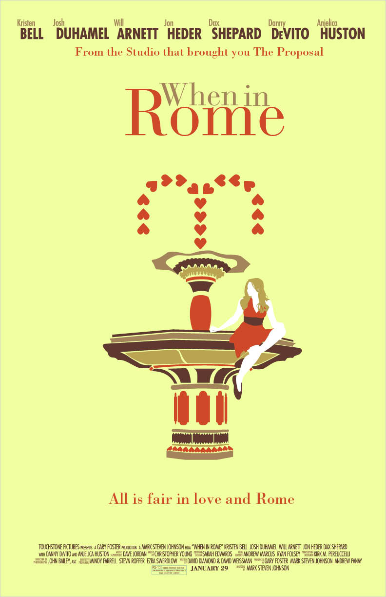
So I had to do a couple different variations of a movie poster of our choosing for my Typography I class and I decided to pick "When in Rome." The movie was so-so, but it was really awesome how they switched back and forth from Rome and the Guggenheim museum in NYC. Their lack luster movie poster is inexcusable for a movie that was filmed in two of the most beautiful places in the world, so I had to remedy this. I wanted to introduce Italian architecture into my piece, so I did a little research and created the graphic fountain based on some of my findings. The fountain is really important to the story, so it's a good fit. I played around with some color schemes, but I think I really like my first piece (the asymmetrical one) best.
Also, props to my friend Sophia for modeling for me and letting me take a zillion pictures of you!
"When in Rome" movie posters
11"x17"
Illustrator, InDesign, photography
Showing posts with label photography. Show all posts
Wednesday, March 23, 2011
Movie Posters
Labels:
2011,
architecture,
fountain,
guggenheim,
illustrator,
indesign,
italy,
love,
photography,
rome,
spring,
typography,
when in rome
Tuesday, March 8, 2011
Moar Produce!
As you can tell, I am having a little too much fun with these produce alphabets. I have another alphabet made out of asparagus that I will clean up in Photoshop and post over break.
Labels:
2011,
alphabet,
Hand Letters,
peppers,
photography,
produce,
spring,
string beans
Psychedelic bread
Having fun with color. And bread. I took pictures of an alphabet I made out of ripped bread, turned them into graphic shapes in Photoshop, and had fun moving them around. It was a very fun project and a much more productive way to use up stale bread.
Type Compositions
Bread and Photoshop
Type Compositions
Bread and Photoshop
Labels:
bread,
color,
Hand Letters,
photography,
photoshop
Tuesday, February 1, 2011
Pretty in Produce
I have even more alphabets for Hand Letters class! Last week, I made a texture out of India ink markers, graphite, and mascara. This week, I scanned that page into Photoshop and pulled out letter forms from the texture. Because of this project, I have found a new love for the magnetic lasso tool.
For homework this week, on top of the weekly alphabet sketch, the class had to make an alphabet out of produce. We could either draw food or take pictures of food ourselves, so I went to the dining hall, grabbed all the fruits and veggies I could carry (without angering the people who work there TOO MUCH), and got to work. I have two pieces because I have a border around the "R" in my original composition and although I really like how it looks, none of the other letters are like thar, so I cut it out in the second one. Also, I made two "A" letters, but didn't have the heart to cut one of them out. Anyone have a preference?
Subscribe to:
Posts (Atom)